BRAND IDENTITY, GUIDELINES & ASSETS
Crown Point Depot
brand identity
I led a project to create an entirely new brand identity for Norwich Crown Point Depot.
The challenge was to design a unifying brand for the site that's home to colleagues from different organisations. The new brand had to respect the heritage of the site while sitting comfortably alongside the modern Greater Anglia and Stadler brands.
Following an initial briefing and discussion I began by organising interviews with colleagues in a range of roles at the site, to understand their connections to the location. Many have worked there for decades, throughout numerous franchise changes.
It became clear that the brand should represent the technical expertise of the engineers at Crown Point, while also carrying a connection to the British railway of the past 40 years. It needed to be distinctly modern, however, avoiding a 'heritage railway' look.
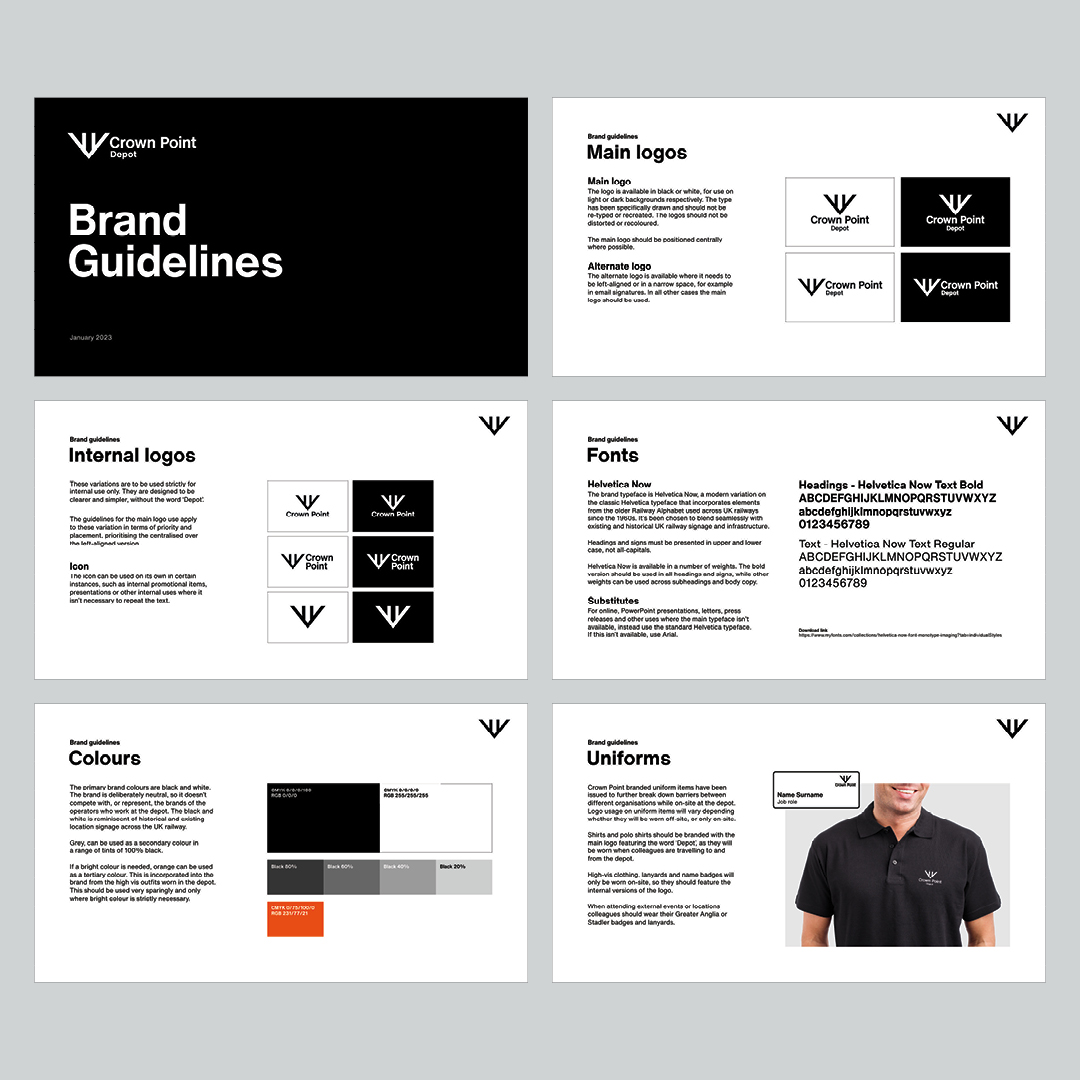
The logo mark is inspired by the instantly recognisable British Rail logo, the ultimate symbol of our railway. It's the same proportion and line weight, but arranged into a different layout that plays on the words 'crown' and 'point' from the site's name.
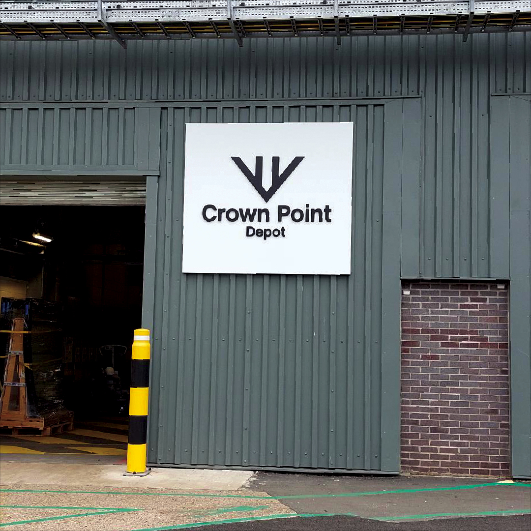
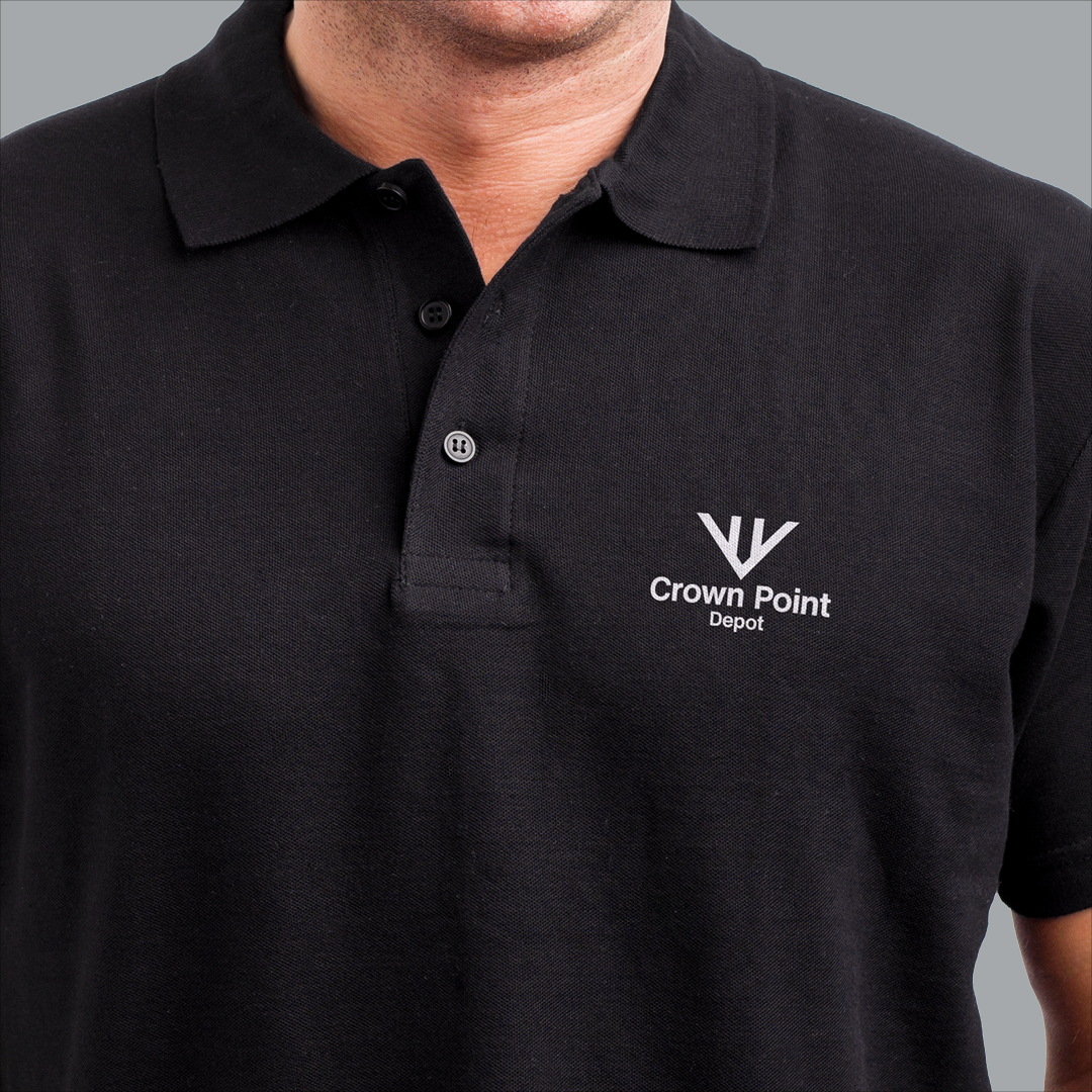
The new branding has been very well received and is now in place throughout the Depot. This includes all of the exterior and interior signage, displays and uniforms.